

McMahon Physical Therapy
A careers hub so McMahon can send candidates one link
One hub, two role pagesElite Total Wellness case study
Elite had grown well past men's health, but its name and look still said men's clinic. We developed a new name, identity, signs and promotional designs that welcome everyone it now serves.
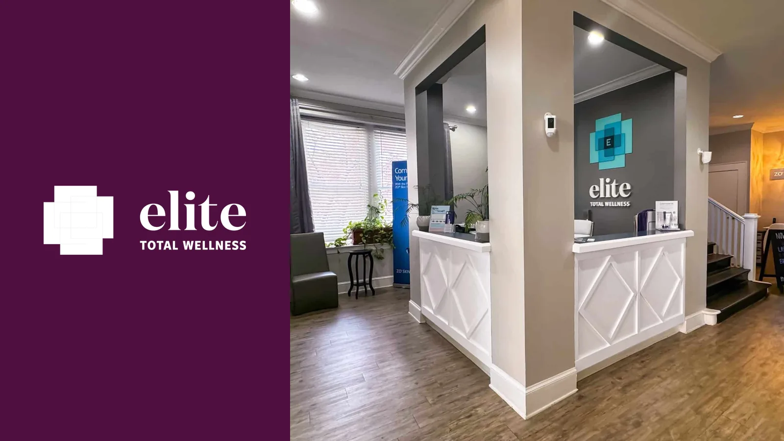
Elite started as a men’s health clinic, then added medical aesthetics, hydration therapy, women’s care and more. The old identity still said “men’s clinic,” so many of the people the practice now served had little reason to think it was for them. Whatever replaced it also had to work downtown, where people walking by and drivers sitting at the stoplight saw the signs.
We renamed Elite Total Health to Elite Total Wellness. The new logo uses four interlocking panels to form a cross, a familiar healthcare cue with its own look, backed by a color and type palette.
Then we designed for the places people would actually see it. Exterior signs speak to passing drivers, and sandwich-board concepts use shorter lines for people on foot. A direct-mail piece and branded scrubs round it out, with a more playful voice for some services.
Elite now has a name and mark that fit the full range of what it offers. The same cross-shaped mark shows up on the storefront, the sidewalk signs, the mailers and the staff’s scrubs, so the clinic looks like one place wherever people run into it.
My business is a complicated model, they broke it down and rebuilt it like the professionals they are!
The work
Tap or click any piece to see it full size.
A careers hub so McMahon can send candidates one link
One hub, two role pages
Ad landing pages that still feel like a family practice
Services + two locations
Mid-South Care owns the top of local search in Memphis, and Nashville is next
Top 3Want something like this for your business? Call 901-522-5002 or book a call.